Great Landing Page Examples To Learn From

A landing page is a great way to drive traffic, improve your SEO and build your brand. The best landing pages lead customers to a specific product, service or offer and encourages them to take action. With a landing page, you have the opportunity to create conversions and build your customer base!
Landing Page
A landing page is a great way to drive traffic, improve your SEO and build your brand.
To define, a landing page is any web page that a potential customer can land on. It is distinct from your homepage and serves a single, focused purpose. It is aimed at following up to any of the promises that you’ve made in your business. Essentially, it’s the next step toward a visitor becoming a customer. Hence, your landing page should provide some sort of special offer, in return for providing contact information. Below let us look at some great landing page examples to learn from. Read on to discover what these businesses do well!
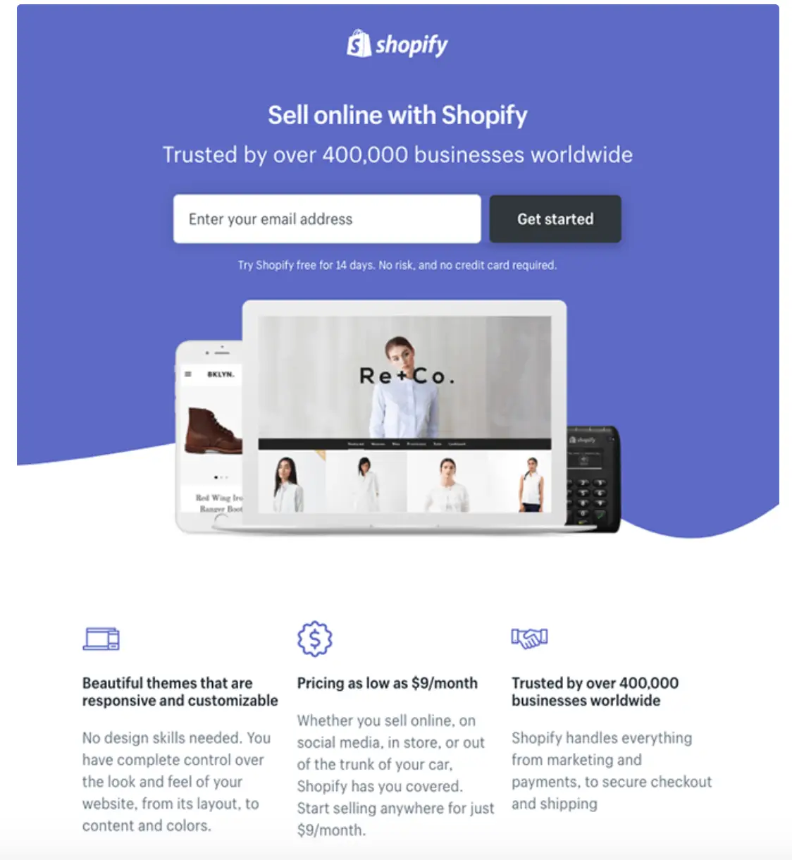
The landing page of Shopify has a good headline and subheadline that contrasts well with the dark background. This makes it attention-grabbing immediately upon landing on the page. Having one form field above the fold makes it easy for visitors to take action. The company logos and the customer testimonial serve as social proof, indicating that there are other big-name businesses and satisfied clients who trust Shopify. Moreover, the minimal copy makes it easier and more enjoyable for visitors to navigate the page. Meanwhile, bullet points help draw attention to the main benefits of Shopify. Finally, the image gives prospects a realistic preview of the dashboard.
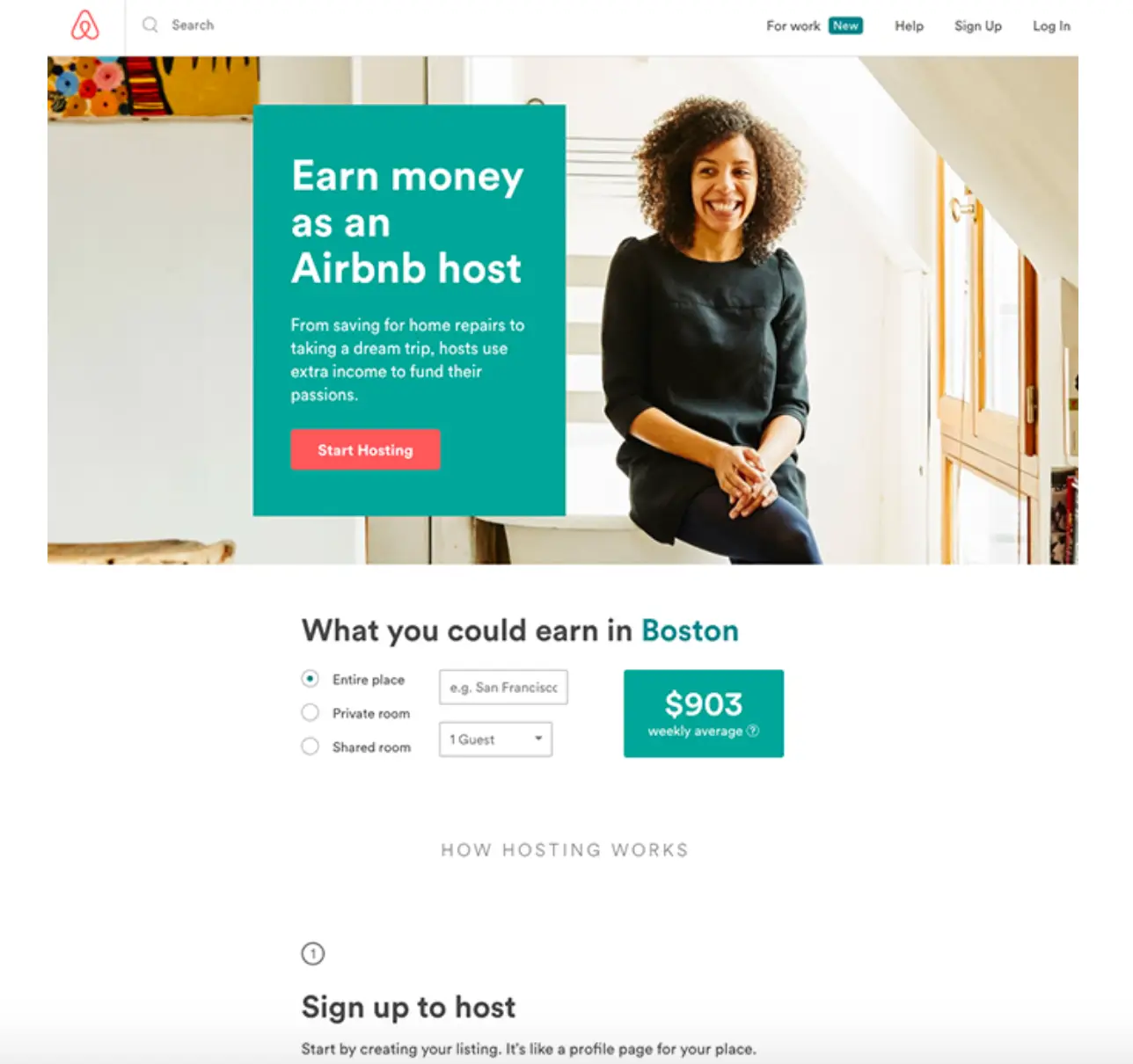
The landing page of Airbnb has an enticing personalization that is used to help convert visitors into hosts. That is, they offer an estimated weekly average earnings projection based on your location. There are customized questions where you can enter additional information about your potential accommodations to get an even more accurate estimation. There is also a clear call-to-action at the top of the page which makes it easy to convert on the spot. The catchphrase “earn money” clearly tells the customer what they want to hear. It gives them an idea of what they can expect if they choose Airbnb’s services. Finally, the image is welcoming. Having a woman smiling and happy leaves a comforting and trustworthy impression on the customer.
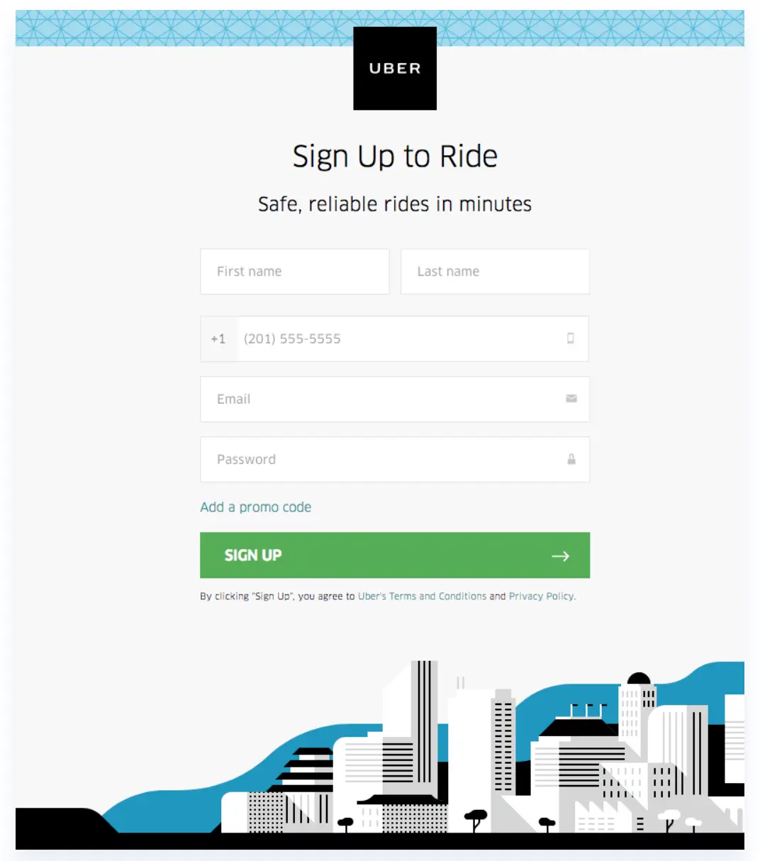
The landing page of Uber has a clear and concise formatting. The Uber Logo is centre and forefront. It is at the top of the page which immediately lets visitors know where they are. The fact that it’s not linked to the homepage acting as an exit link is also a plus. The five form fields are appropriate for a signup page, especially since they don’t ask for very personal information. The optional promo code field is also smart because it doesn’t appear unless prospects click. This keeps the form limited to five fields. Finally, the green Call to Action (CTA) button stands out because there’s no other green on the page. The arrow on the CTA button acts as a directional cue, indicating that visitors should click to see what’s on the other side of this post-click landing page.
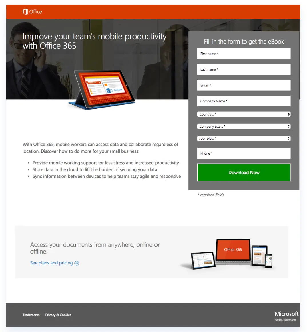
The landing page of Microsoft is a good lead magnet. It tells the customer to subscribe for an ebook, hence, collecting email addresses and other details. There is also the presence of important and useful links such as the blue hyperlink offering details on plans and pricing. A benefit-oriented headline lets visitors know that they could improve their team’s mobile productivity with Office 365. This encourages them to learn more with the ebook. There is also a product image, which shows customers what they’ll receive if they choose to download the ebook. Moreover, clear and concise bullet points allow customers to scan the page for the relevant information. Finally, the green CTA button is attention-grabbing because it contrasts well with the rest of the page.
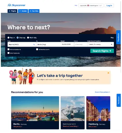
The landing page of Skyscanner has a directive slogan phrased as a question. This encourages consumers to their call to action and use their service to search. Intimate slogans and the use of personal pronouns such as: “Let’s take a trip together” and “Recommendations for you” engage the customer. The presence of beautiful images entices the prospect to all the amazing places they can visit. The page is easy to navigate, offering more than just flights, but also hotels and transport. Easy, obvious and hyperlinked headers are in blue, hence, standing out. Finally, there is a feedback tab in the corner that follows as you scroll down the page. This is a way of encouraging customers’ interaction with the page.
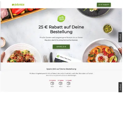
The landing page of HelloFresh has a directive slogan that is repeated on the CTA buttons. A personalized deal capitalized in the banner stands out as enticing. The green CTA button is attention-grabbing and used more than once. There is an appropriate image that shows the prospective customer what meals they can create and also a clear description of what HelloFresh offers. The HelloFresh logo is visible at the top of the page and is not hyperlinked. Finally, the feedback tab in the corner is a way of encouraging customers’ interaction with the page.




Responses